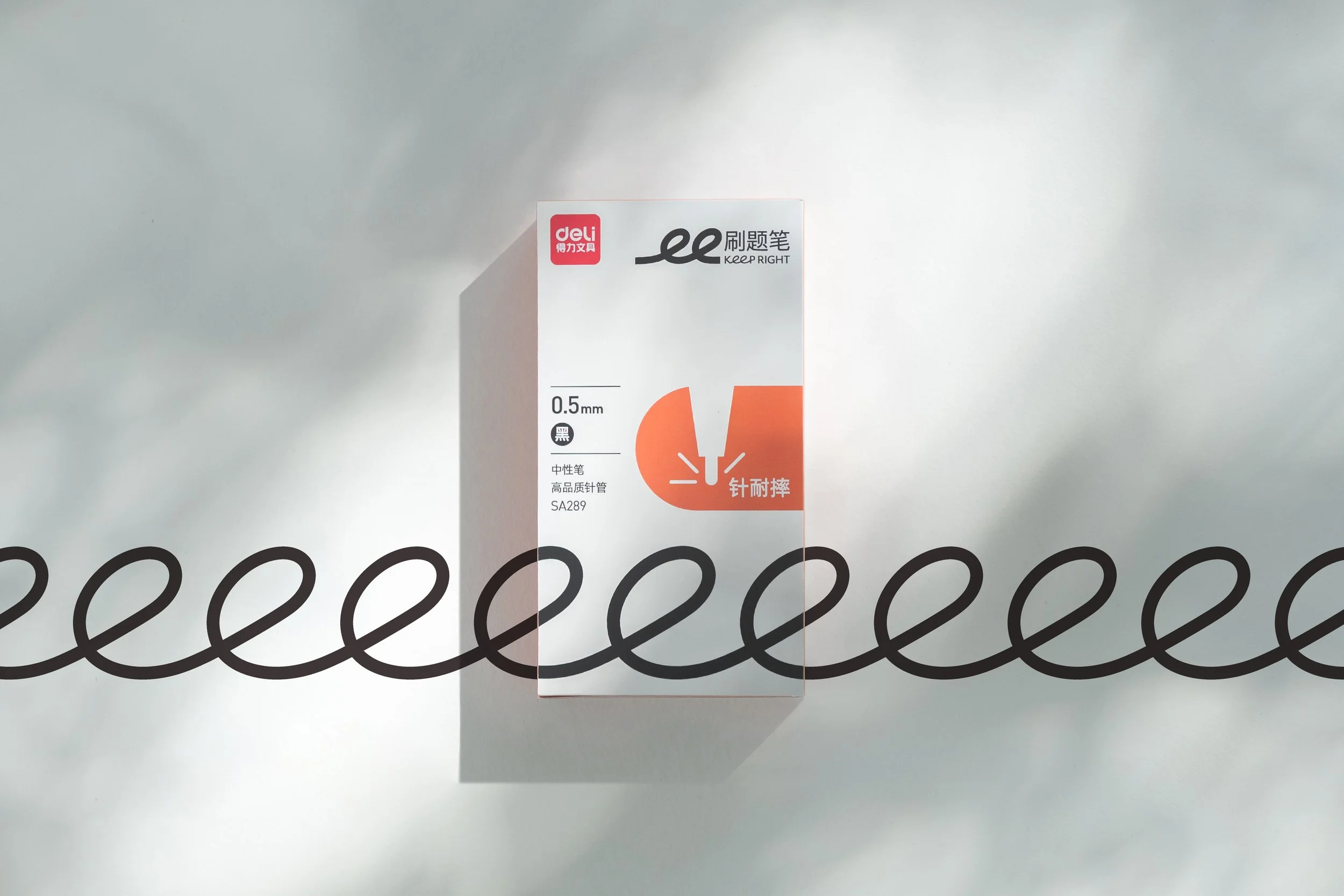
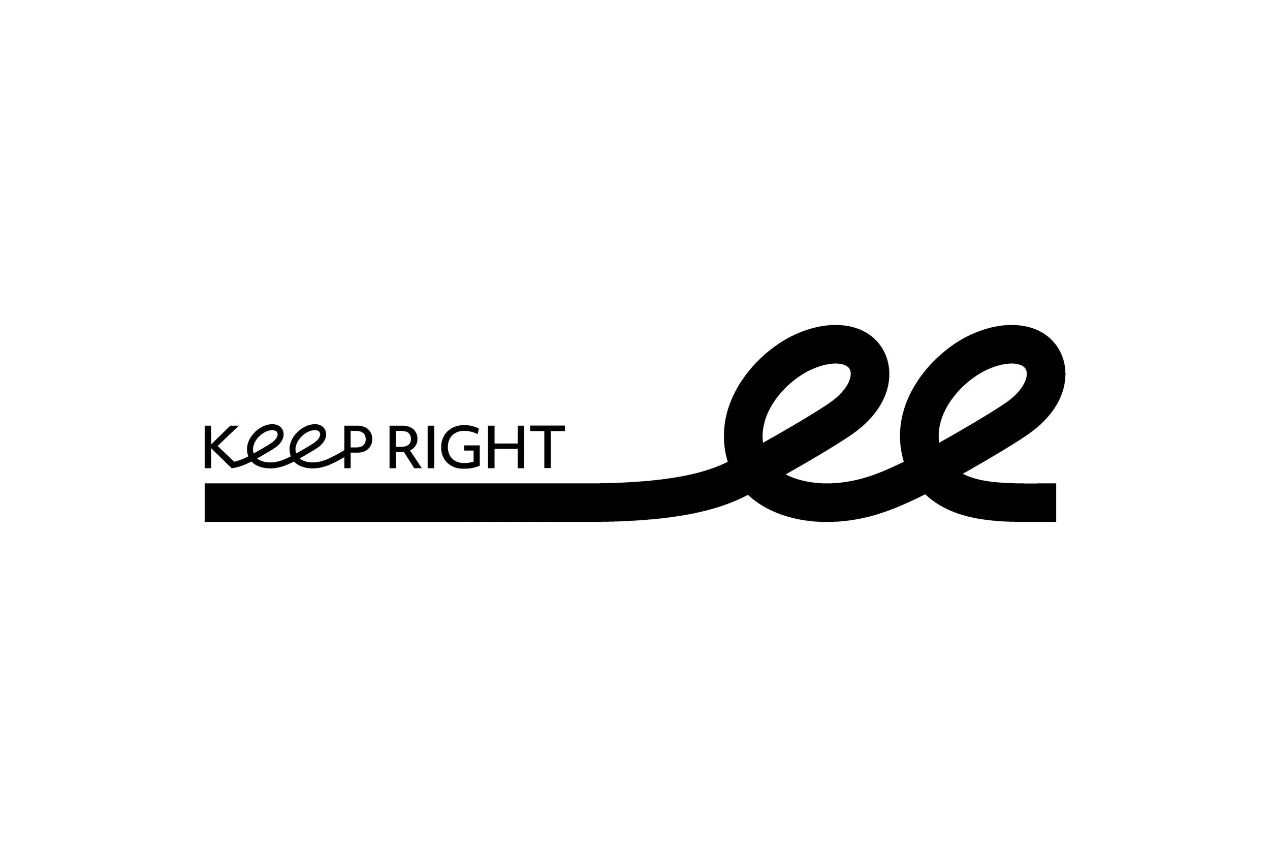
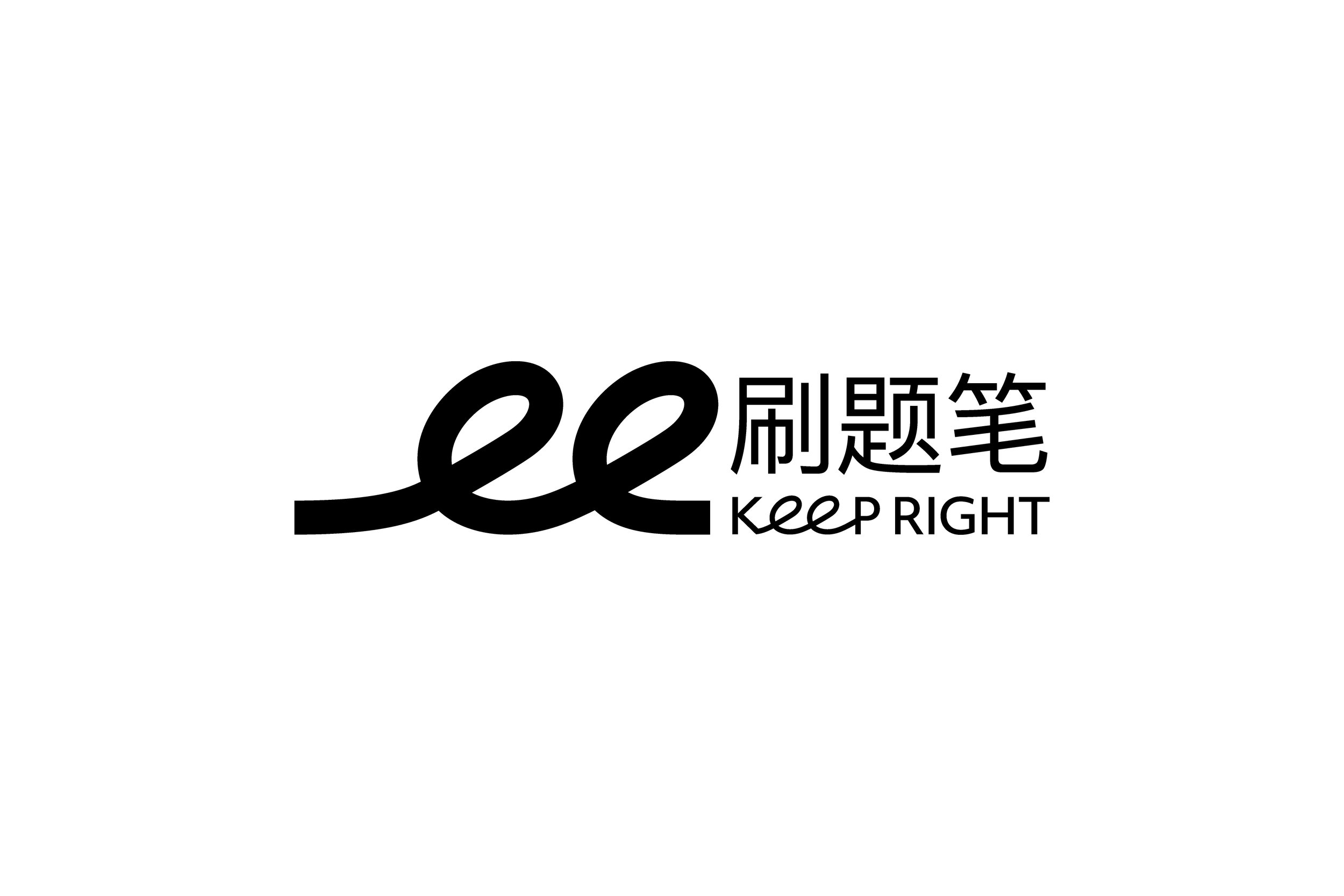
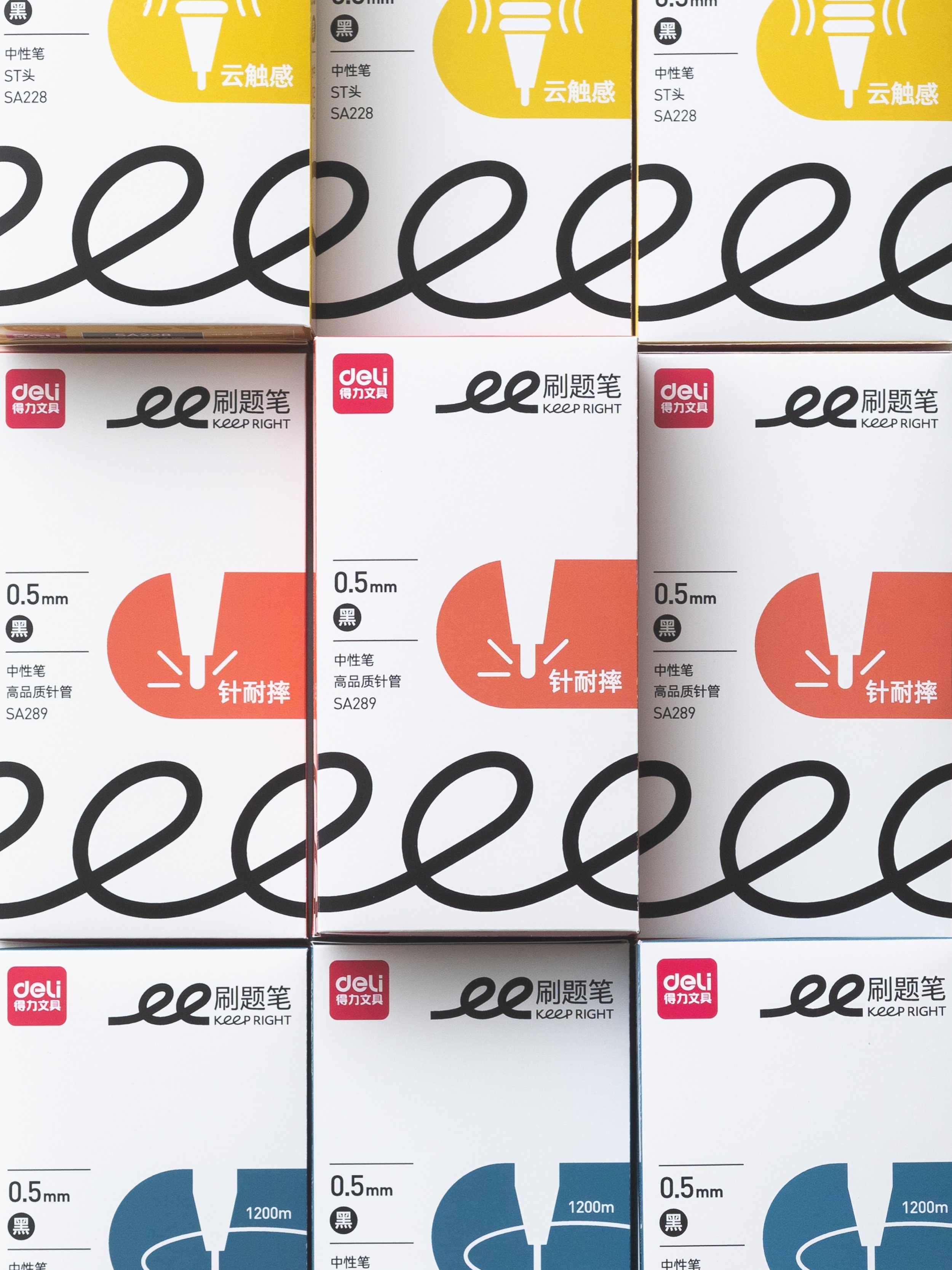
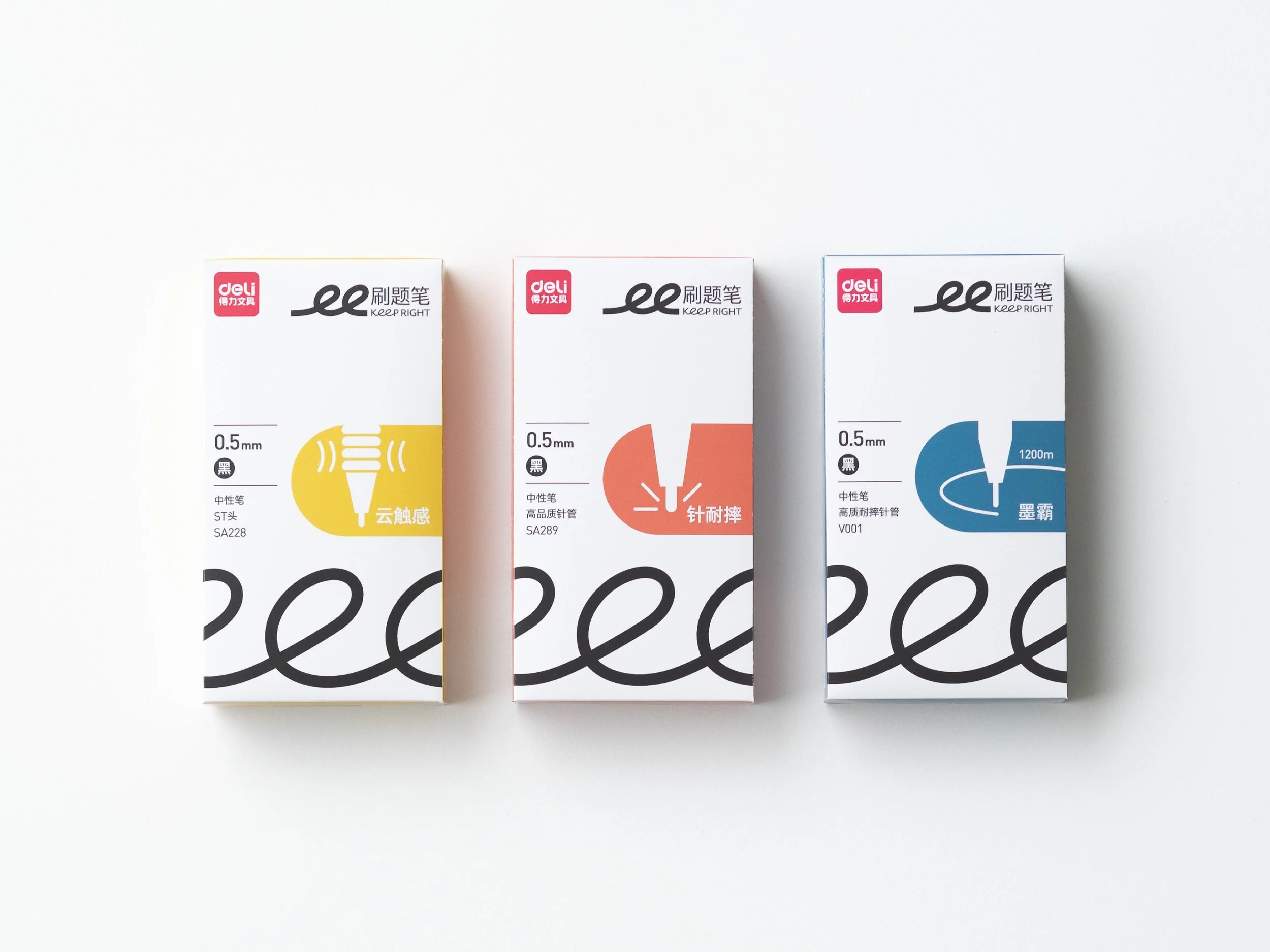
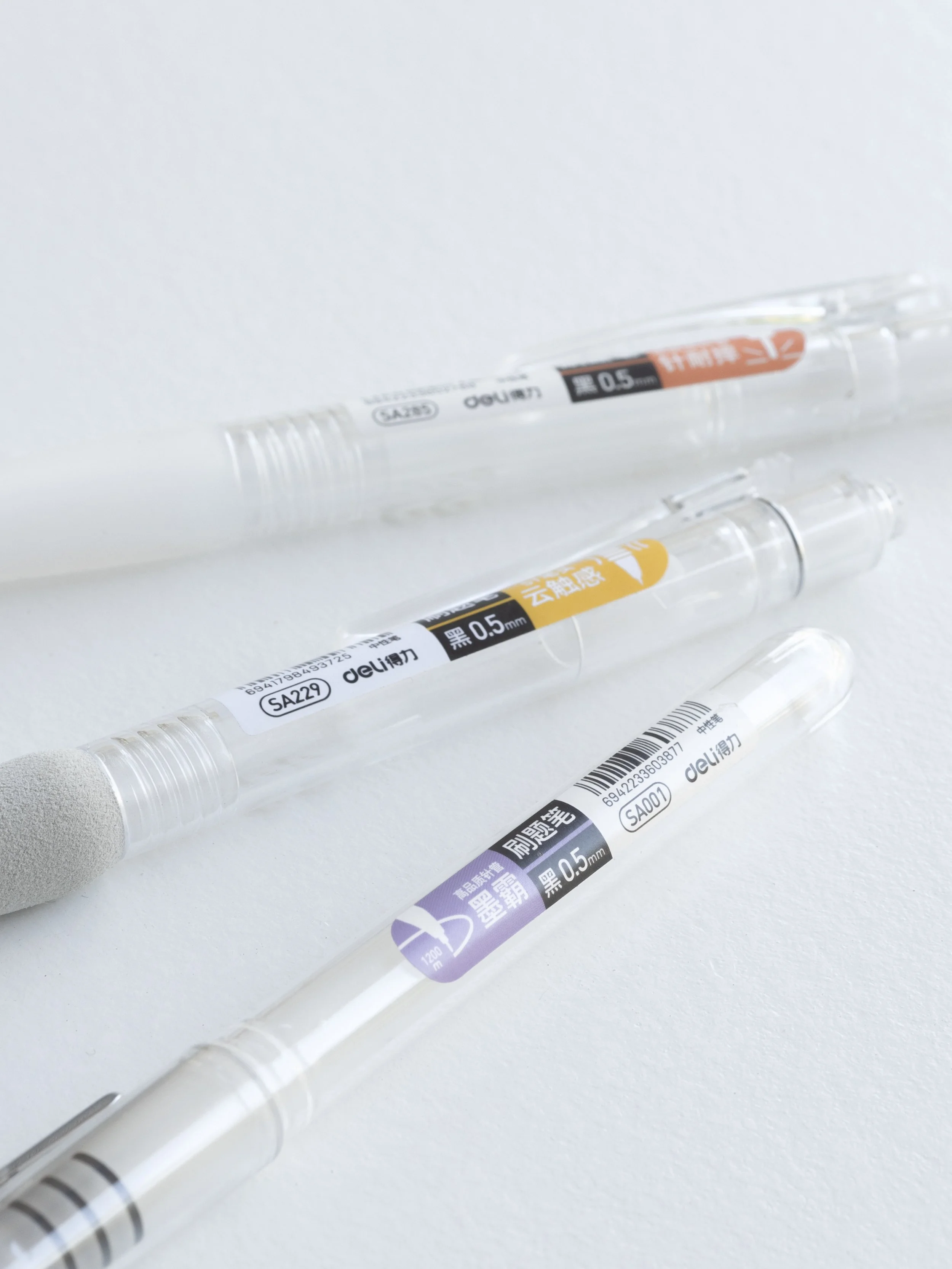
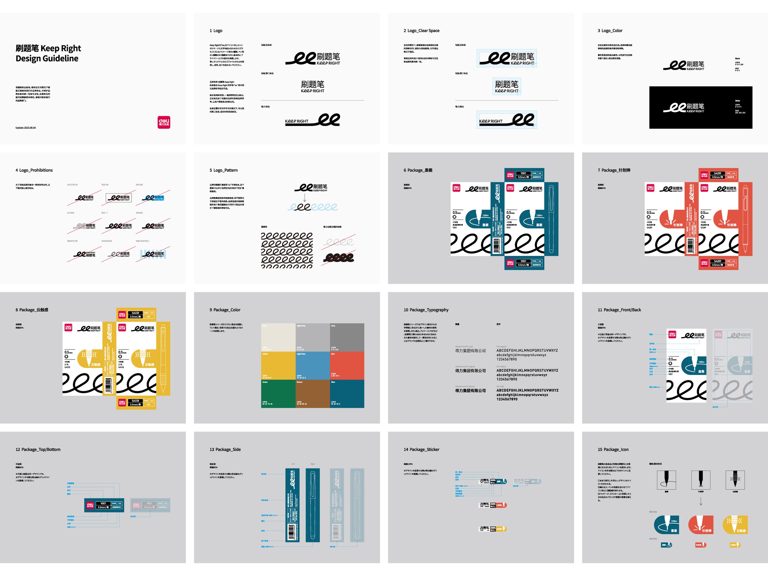
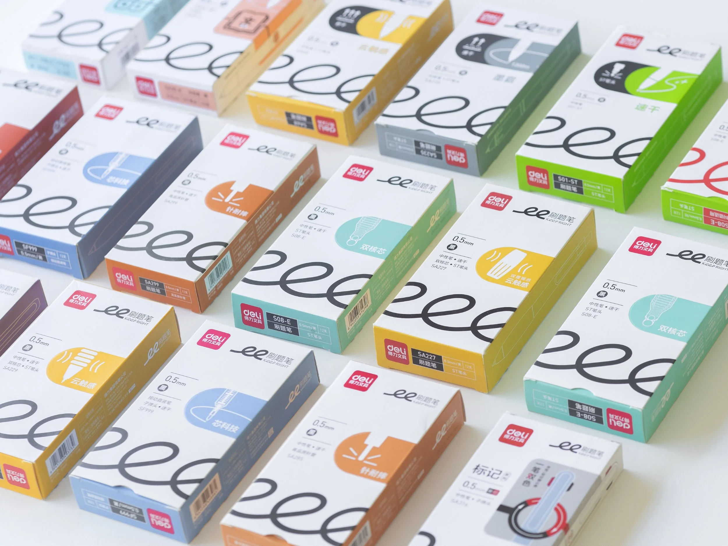
deli KEEP RIGHT

deli Keep Right

Logo Design, Packaging

中国の大手文具メーカーdeliの新ブランド「Keep Right」のロゴとパッケージデザインを担当しました。「たくさん書き続けられるほど快適」というKeep Rightのコンセプトから発想を広げ、ブランド名の ee をくるくるとつながる一本の線として表現し、アイキャッチとして開発しました。この線が、30種以上にわたる商品群をゆるやかにつなぎます。

We designed the logo and packaging for Keep Right, a new brand by China’s major stationery company deli. Inspired by the concept of “comfort that lets you keep writing,” we turned the ee in the name into a single swirling line as the brand’s key visual. This line gently connects the more than 30 products in the lineup.

 
more case study

Client:DELI GROUP CO.,LTD. / 2023