deli KEEP RIGHT

deli Keep Right

Logo Design, Packaging

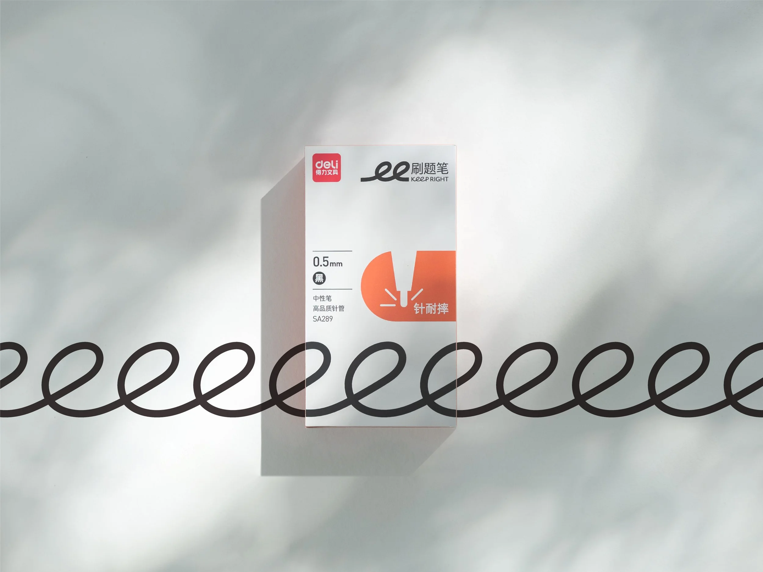
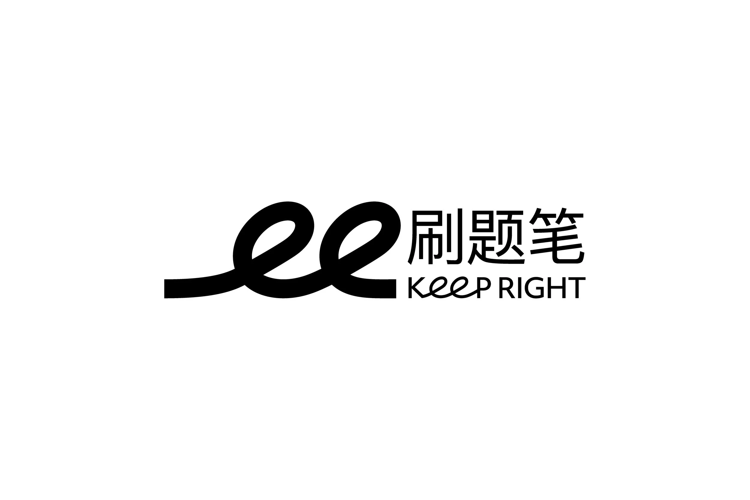
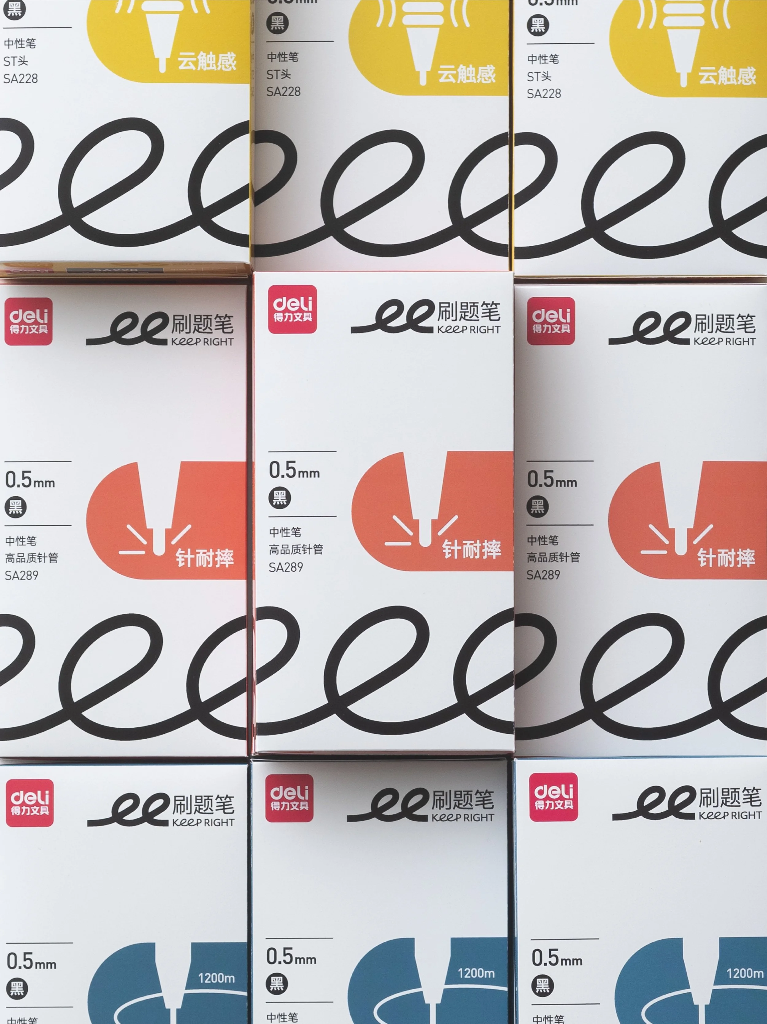
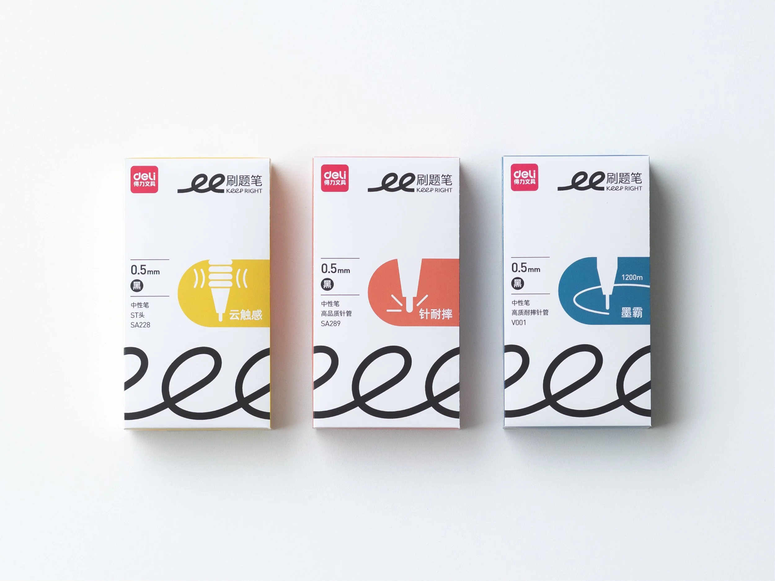
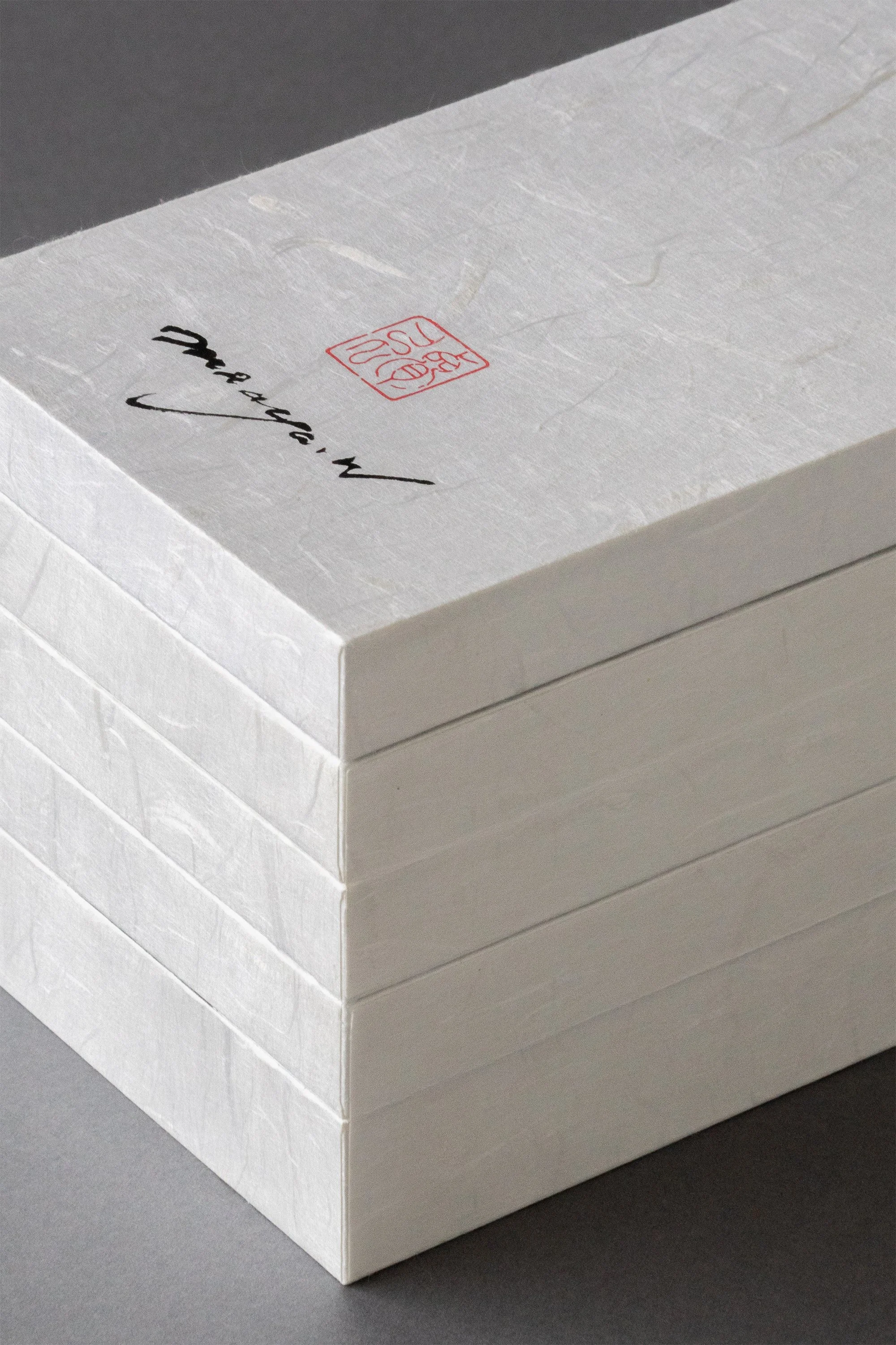
中国の大手文具メーカーdeliの新しいブランドKeep Rightのロゴとパッケージデザインを担当しました。今回私たちは、Keep Rightのコンセプトである「たくさん書き続けられるほどの快適さ」から発想し、くるくるとつながる一本の線をブランドのアイキャッチとして開発しました。この線が 30 種類以上にわたる商品群をゆるやかに束ねます。

We designed the logo and packaging for Keep Right, a new brand by China’s leading stationery company, deli. Inspired by Keep Right’s concept of “comfort that lets you keep writing,” we created a single swirling line as the brand’s visual motif. This line gently unifies the brand’s more than 30 products.


紐をほどき、蓋をそっと持ち上げると、10周年のマークがエンボスされたホログラムスリーブが現れます。開封のひとときを楽しんでいただけるよう、異なる素材を組み合わせ、手触りや質感にもこだわりました。シンプルな中に、触れるたびに豊かさを感じられる仕上がりを目指しています。

Untie the cord and gently lift the lid—inside, a holographic sleeve embossed with the 10th anniversary mark is revealed. To make the unboxing moment enjoyable, we combined different materials with careful attention to texture and feel. The result is a simple yet rich design that offers a sense of depth every time you touch it.


蛇腹の背面にあしらわれた「道」の文字は、書家・Maaya Wakasugi氏によるものです。書の魅力がより際立つよう、屏風を思わせる蛇腹構造を採用しました。

The character “道” on the back of the accordion-fold is written by calligrapher Maaya Wakasugi. We chose the accordion-fold structure, reminiscent of a folding screen, to highlight the beauty of the calligraphy.

 
more case study

Client:DELI GROUP CO.,LTD. / 2023