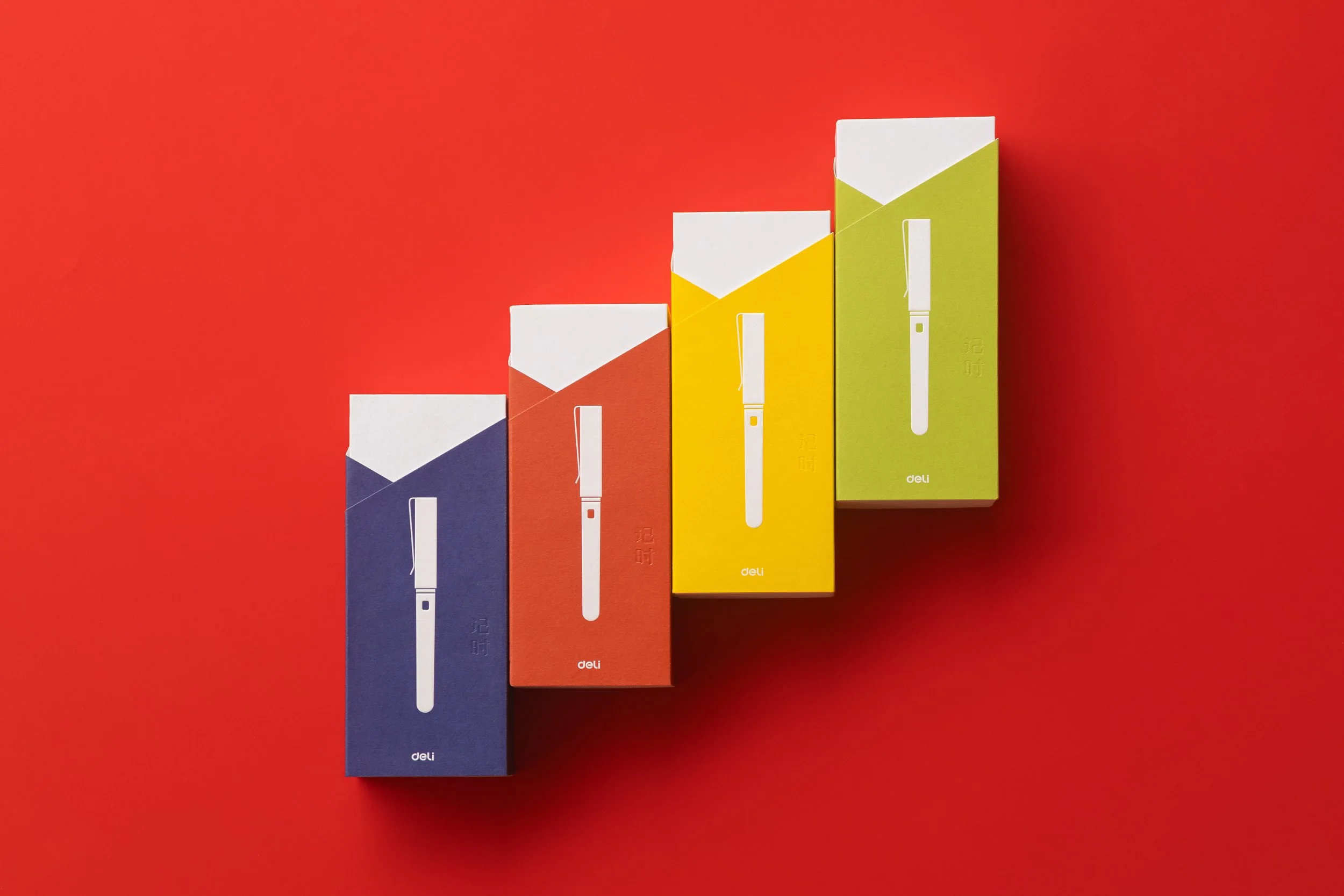
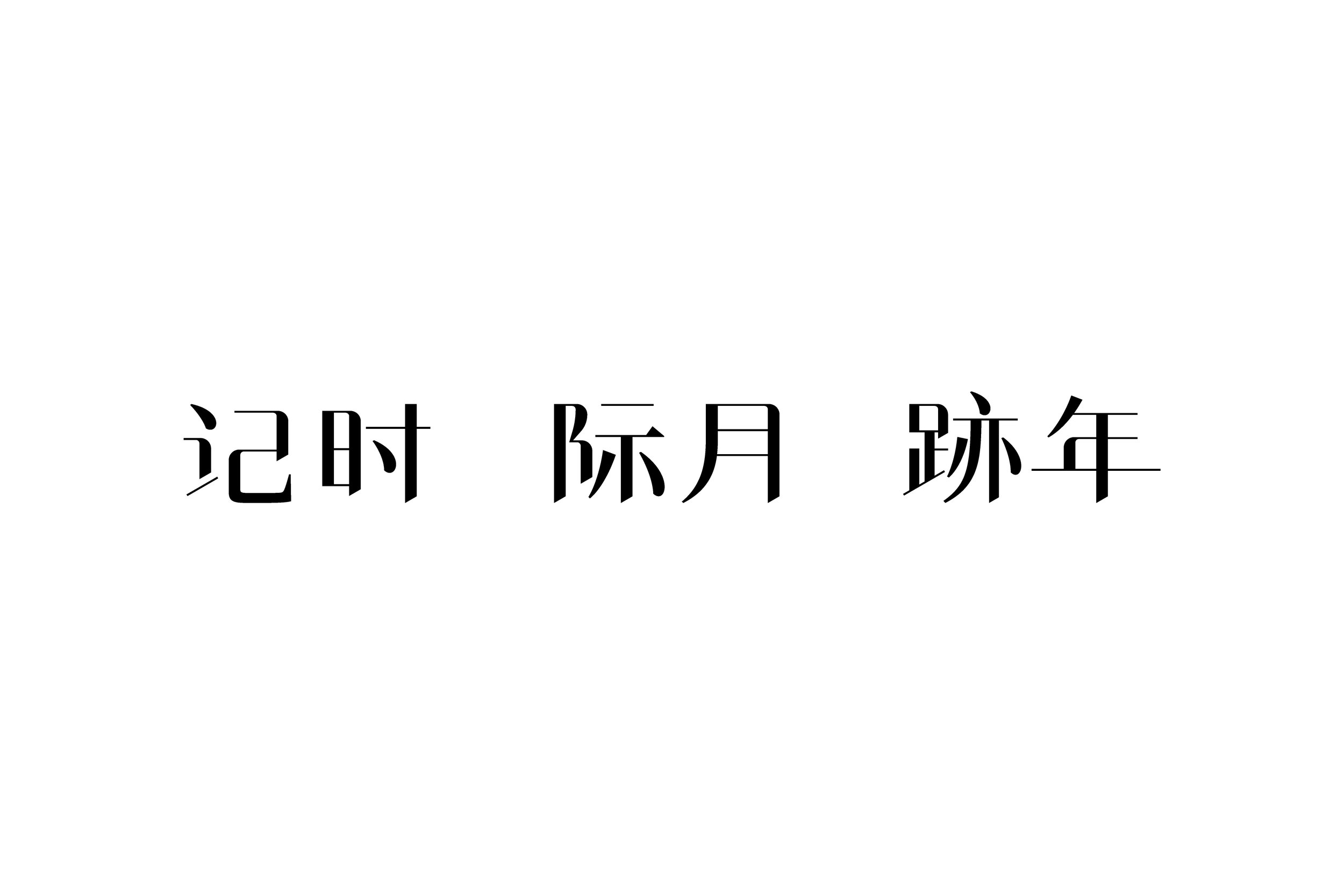
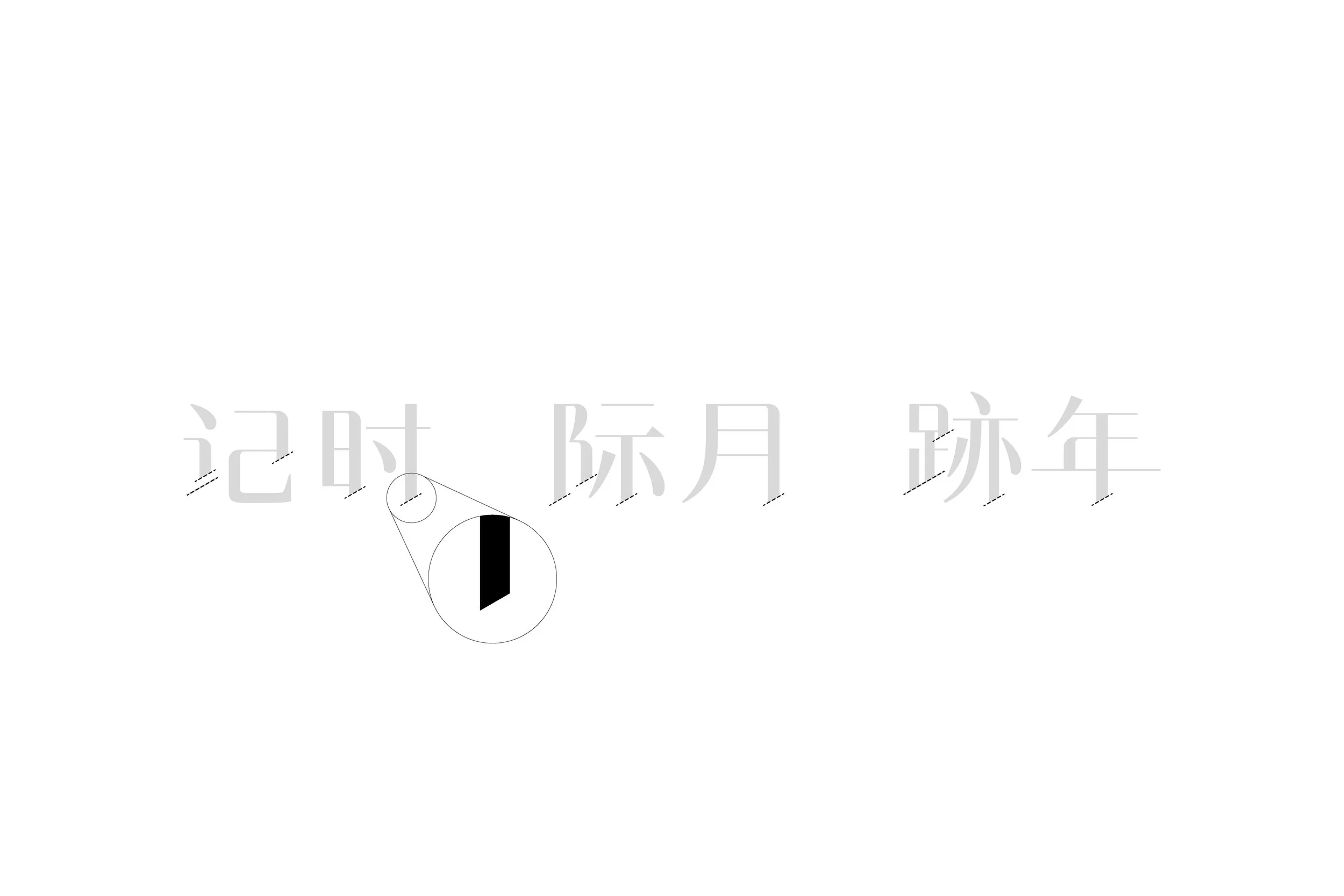
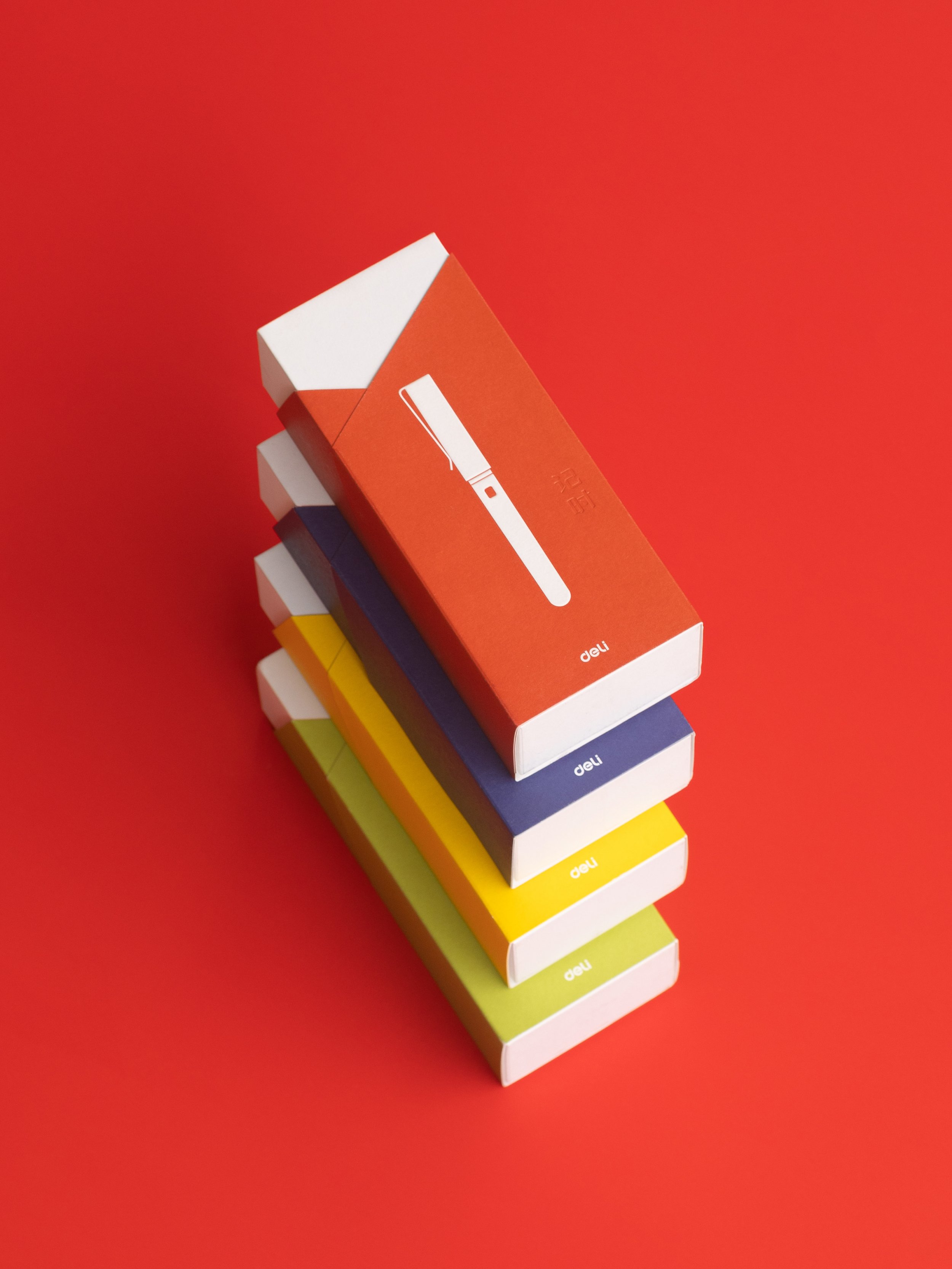
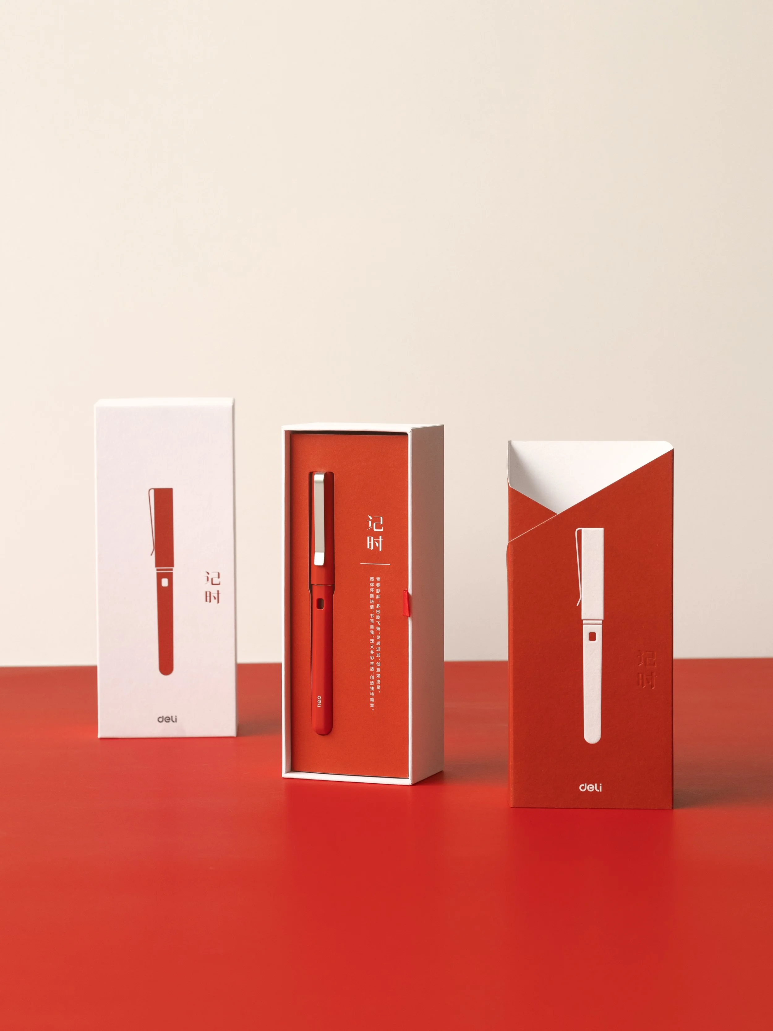
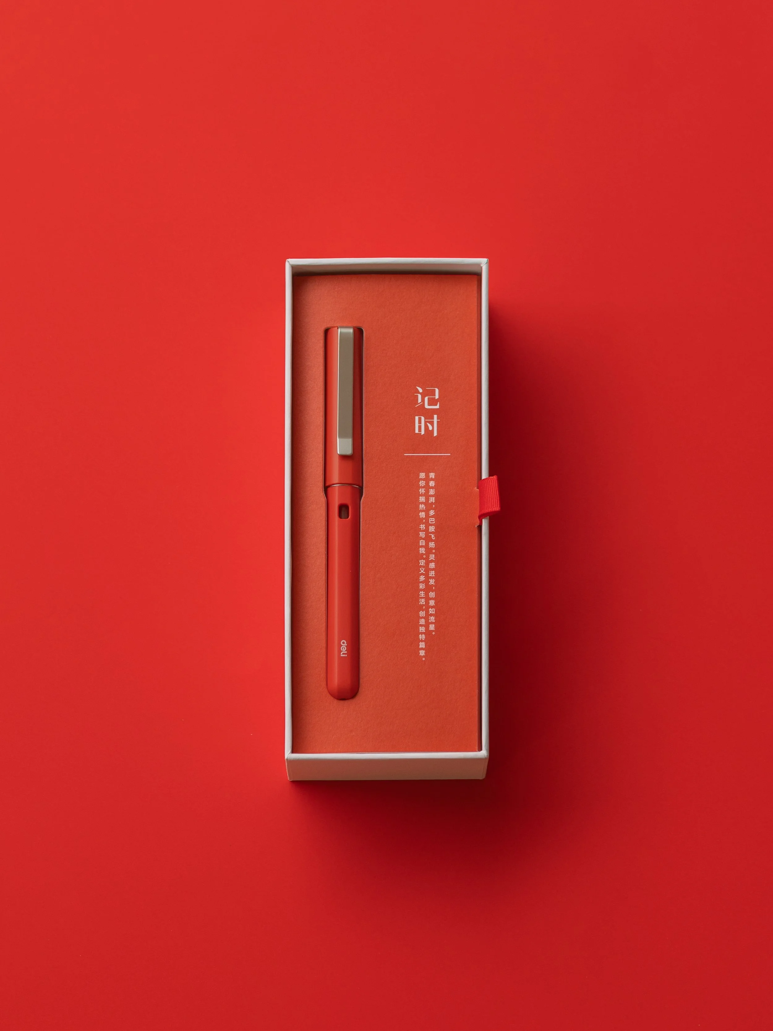
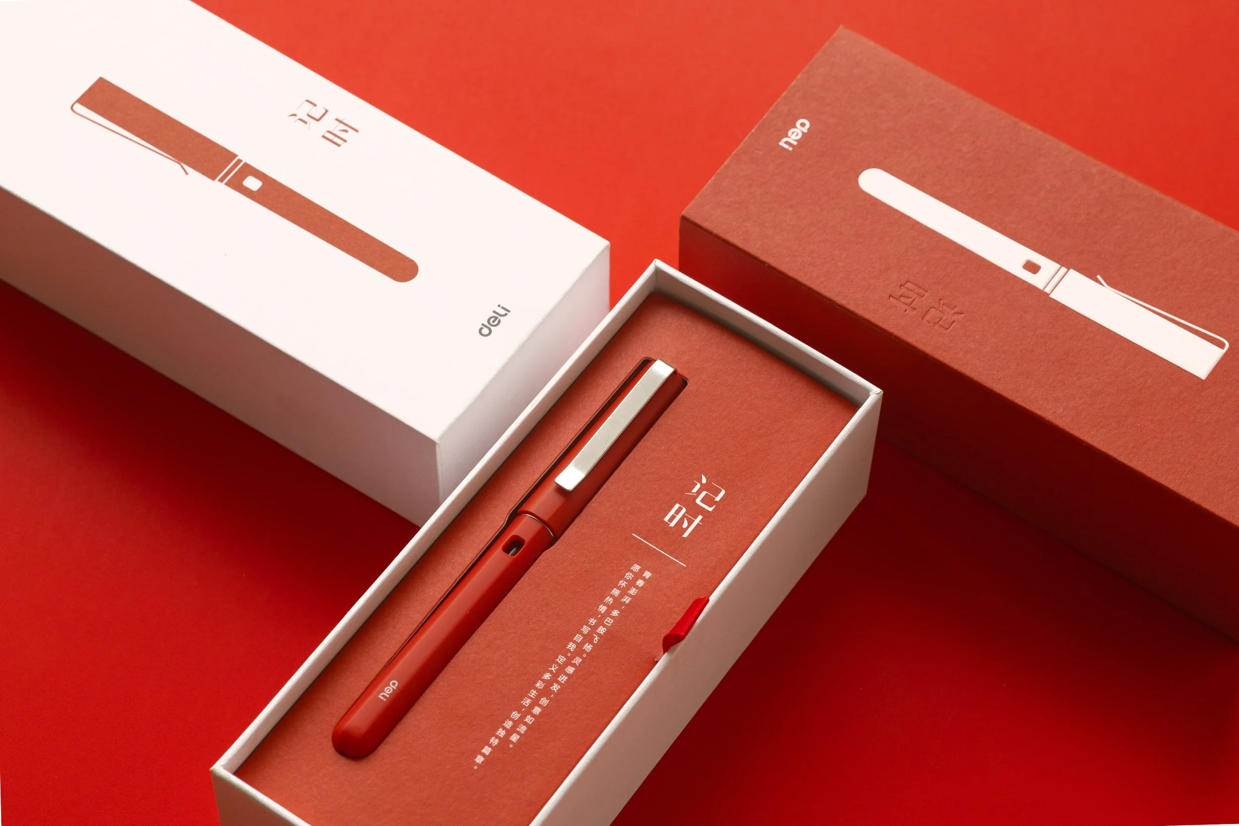
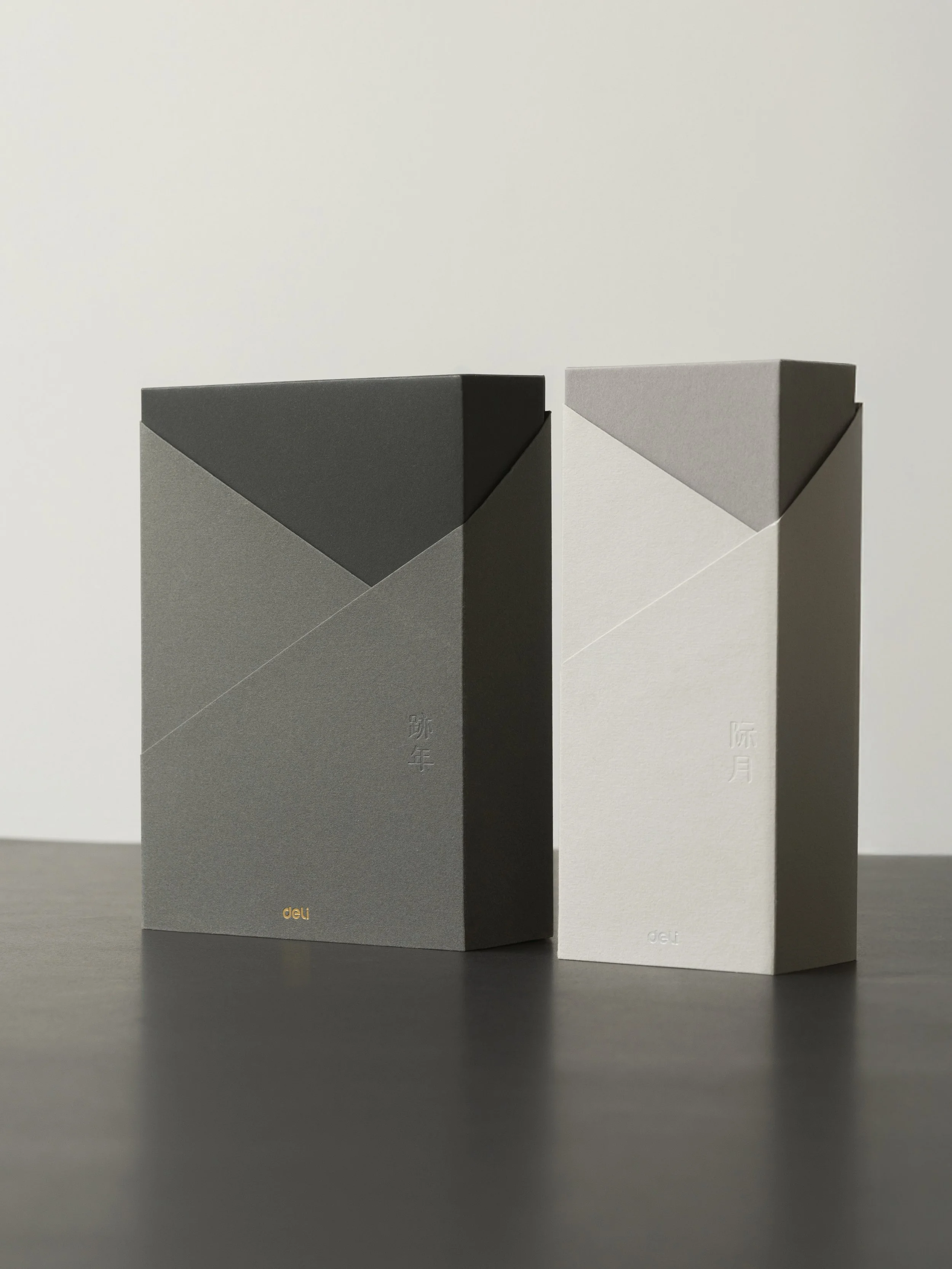
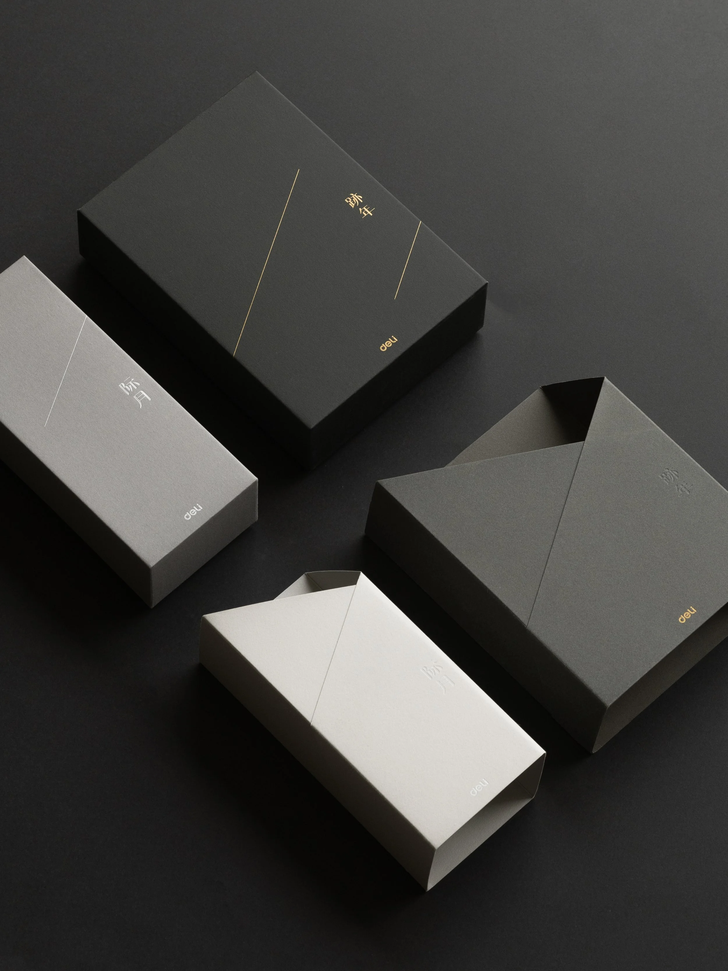
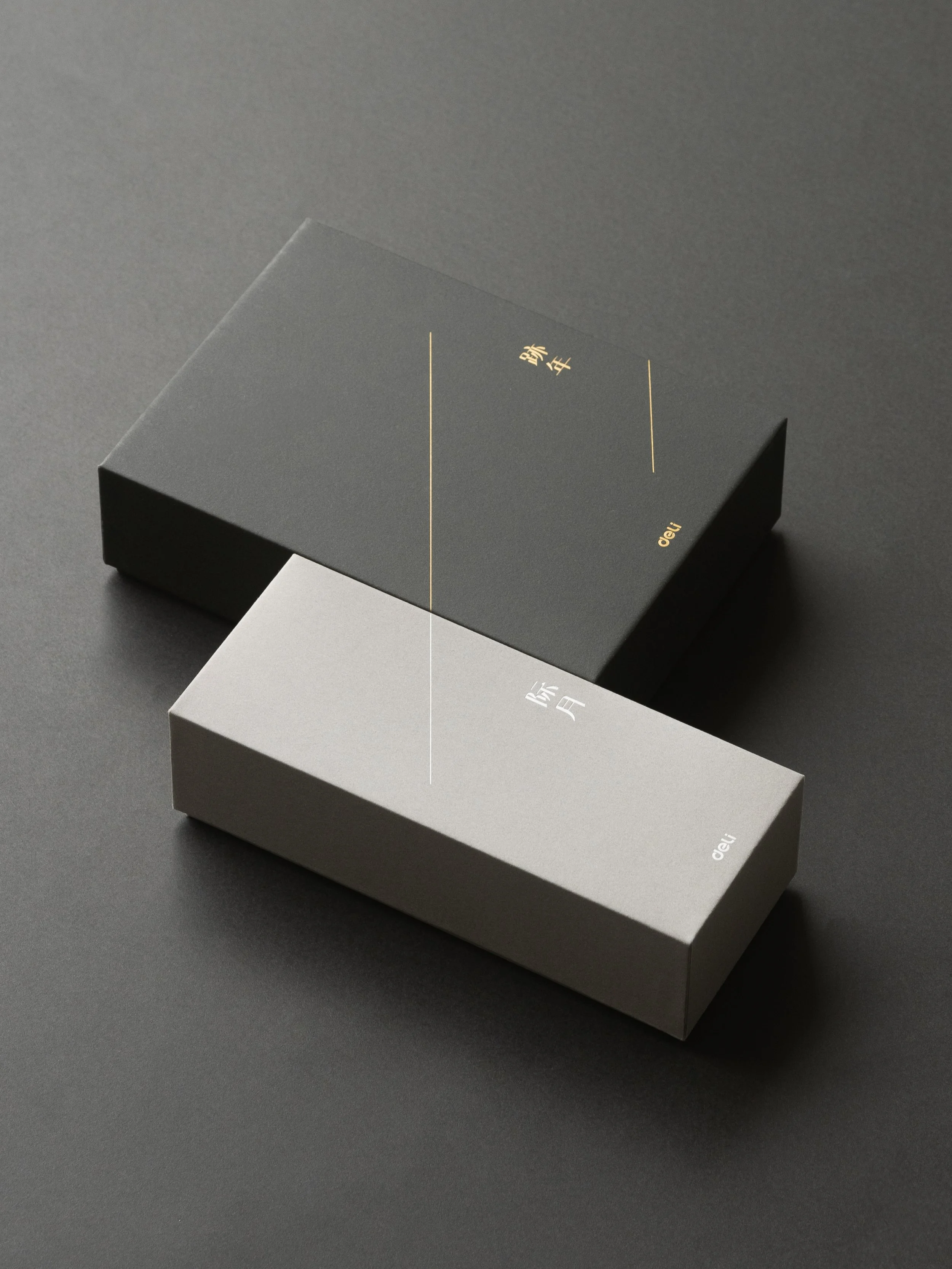
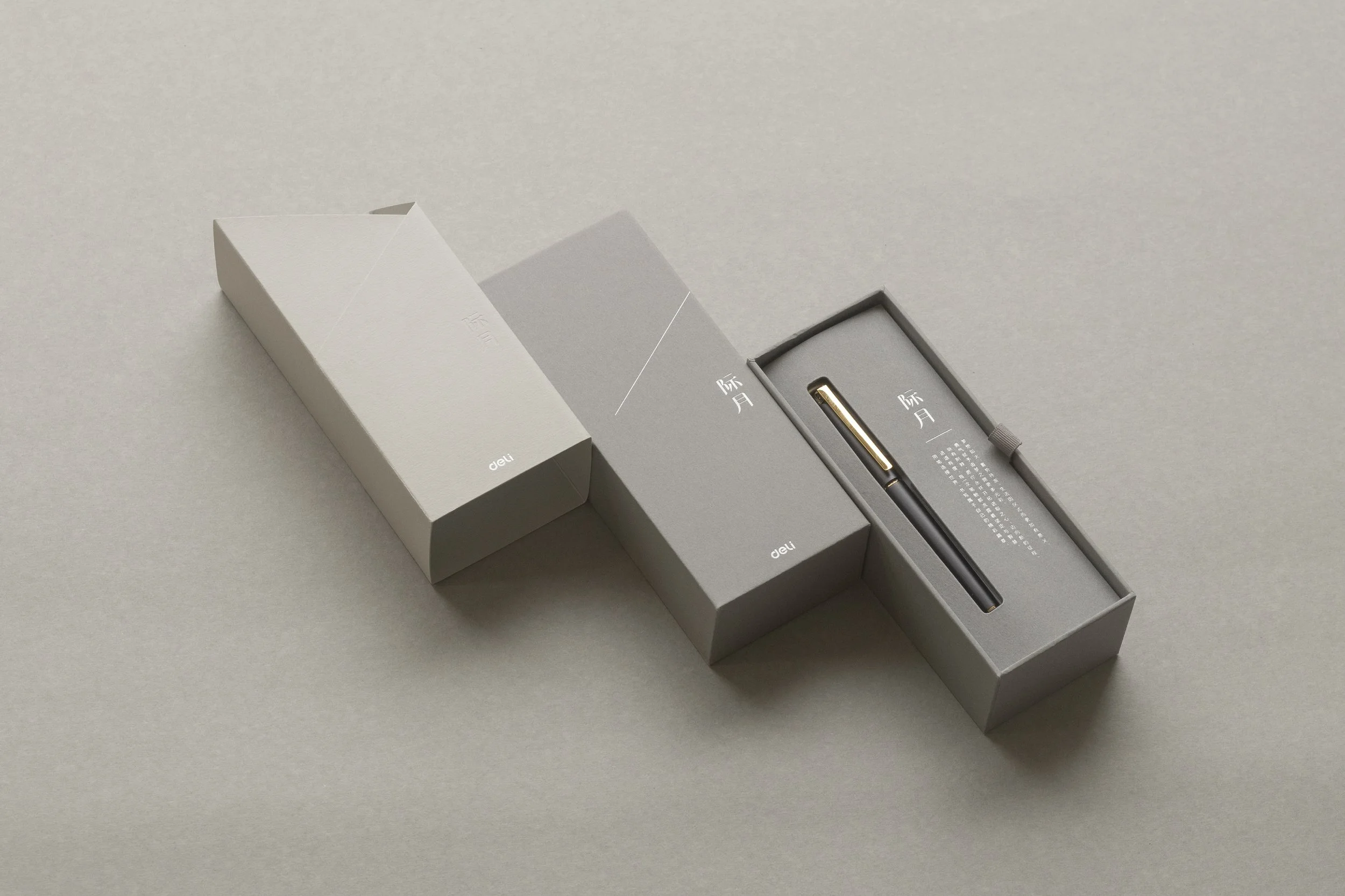
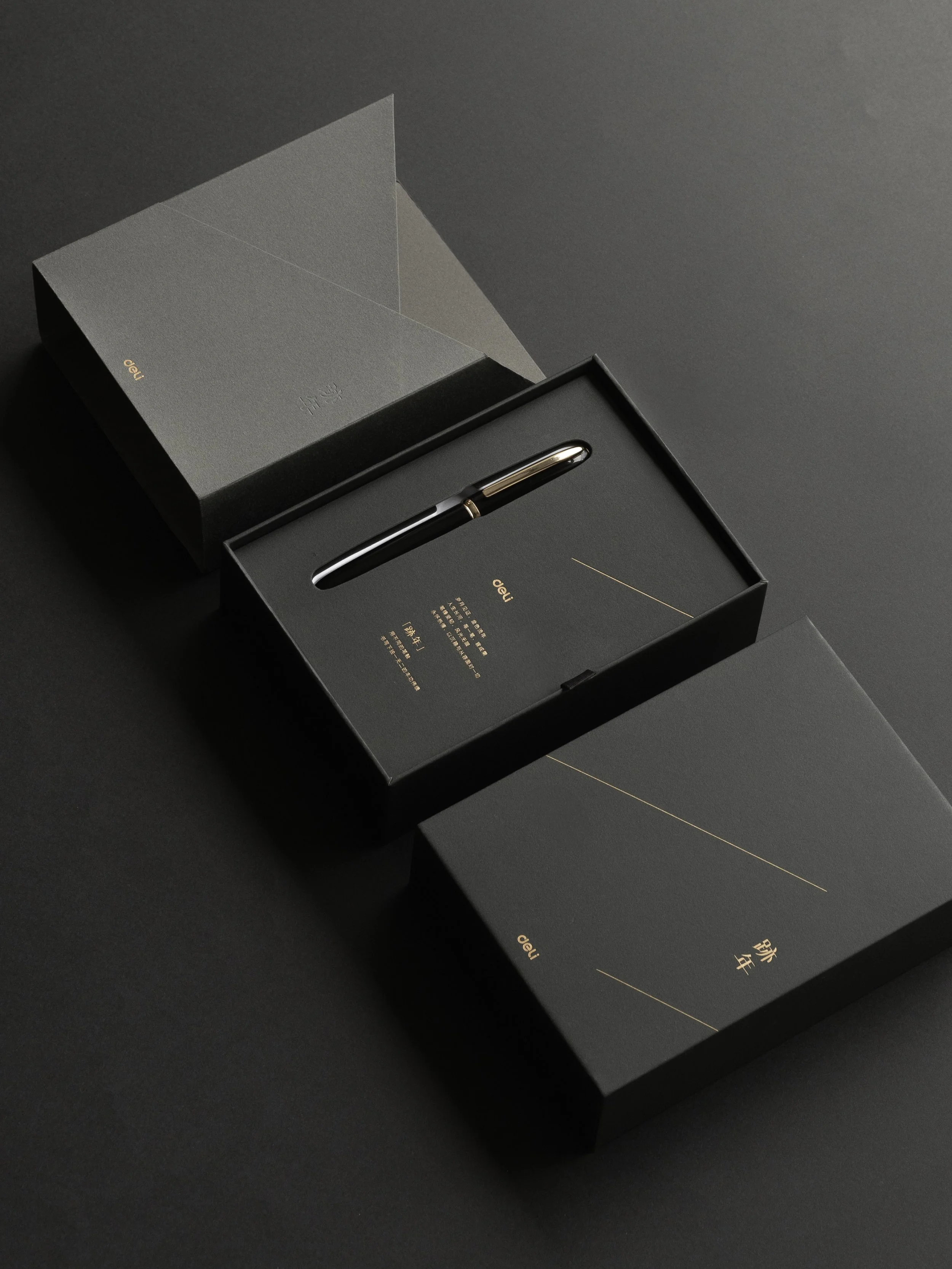
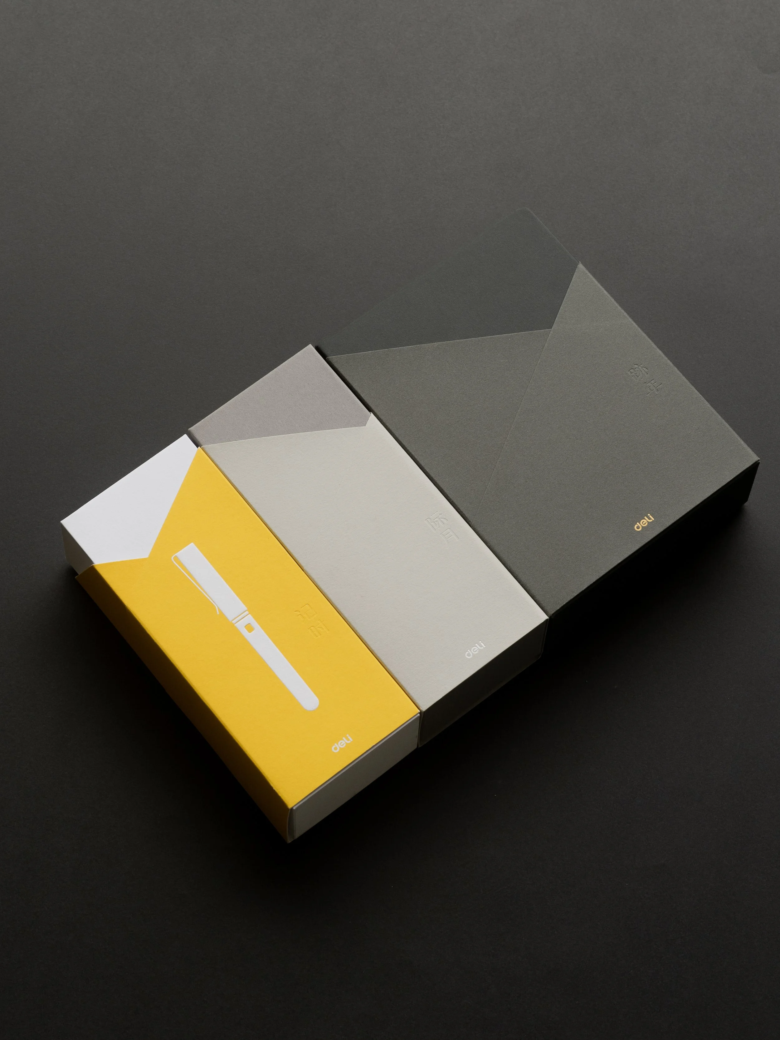
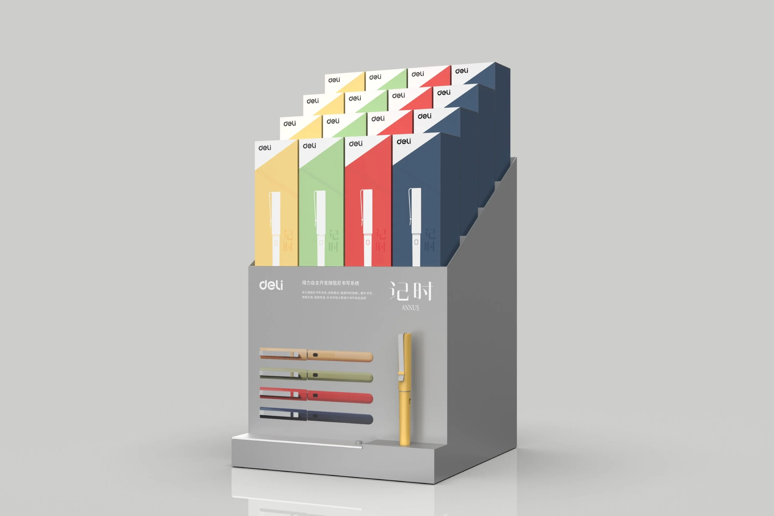
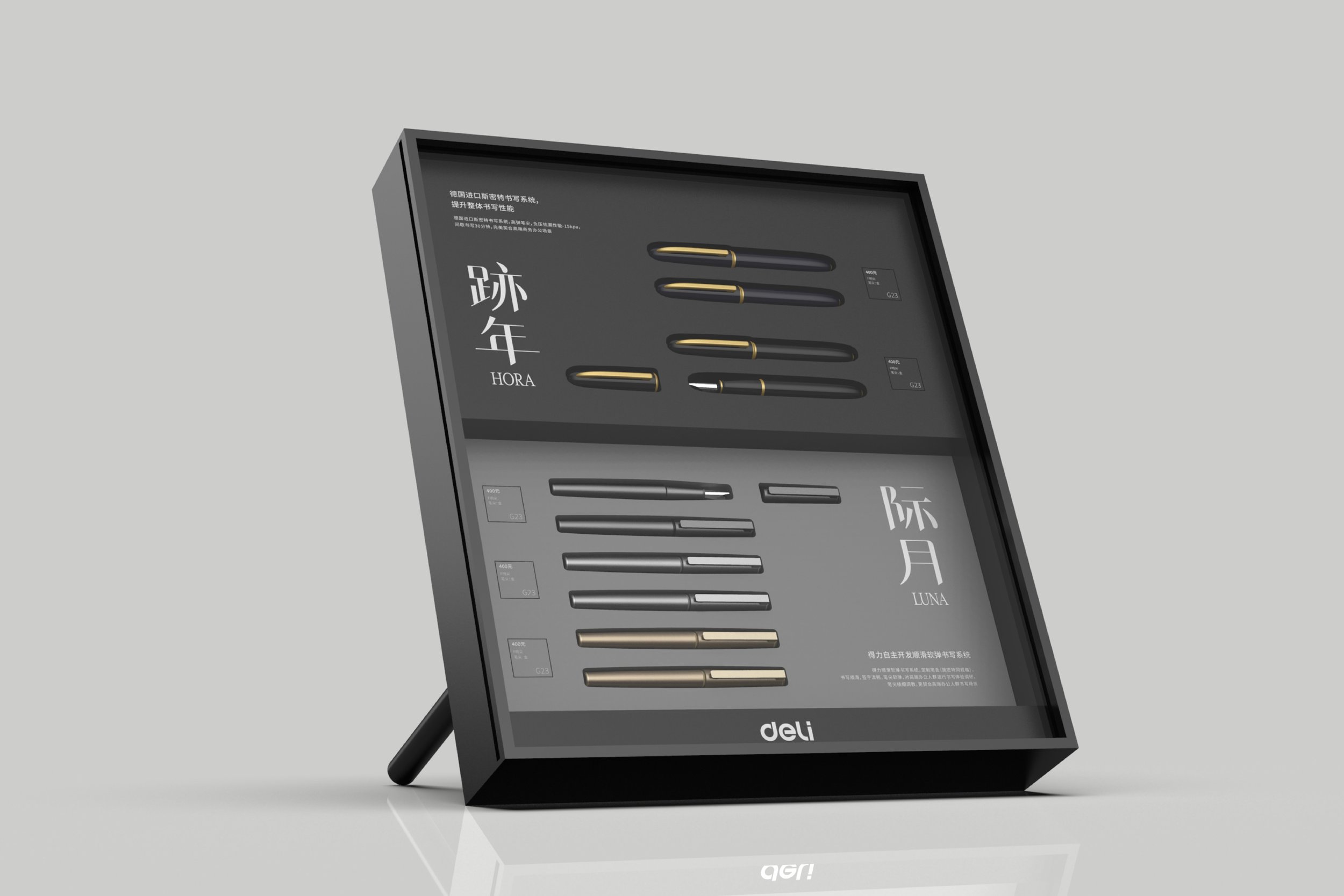
3つのラインで展開される万年筆について、名前づくりからロゴ、パッケージデザインまでを担当しました。ターゲットが20代・30代・40代と世代ごとに分かれていたことから、「记时(記時)/际月(際月)/跡年」という、文字を書く行為と人生の歩みを重ね合わせた名前を考案しています。また、3つの頭文字がいずれも中国語で「ジィー」と発音される点も、ブランド全体に結束感をもたらす要素として意識しました。
We developed the names, logos, and packaging for three fountain pen lines. Targeted at people in their 20s, 30s, and 40s, the lines were named “记时 / 际月 / 跡年” to reflect the relationship between writing and the passage of life. We also intentionally chose names whose initials are all pronounced “jì” in Chinese, creating a sense of unity across the brand.