toppo_01.jpg

lotte TOPPO

ロッテトッポ

Logo Design, Packaging

時代の変化に合わせ、従来のToppoロゴをフラットな表現に変更し、より洗練された印象をブランドに持たせました。 Toppoの“最後までチョコたっぷり” の特徴を大切に、プレッツェルにチョコが注がれるイメージをフォーマットとして、Toppoの美味しさを表現しました。

We redesigned the brand logo and packaging for LOTTE TOPPO to give a more sophisticated look. Valuing TOPPO's uniqueness, "rich chocolate till the last bite", we used the image of chocolate pouring into the pretzel shell to express the deliciousness. 


レギュラーラインに対し、季節を楽しむスポット商品として、フレーバーが持つ空気感を大事にしています。 素材に関連するパターンやトレンドを取り入れることで、ユーザーの好奇心に響くデザインを心掛けています。

As opposed to the regular line, this line values the seasonal flavors and ambiance. By incorporating patterns and trends related to the ingredient, we create designs that appeal to consumer curiosity. 

toppo_05.jpg

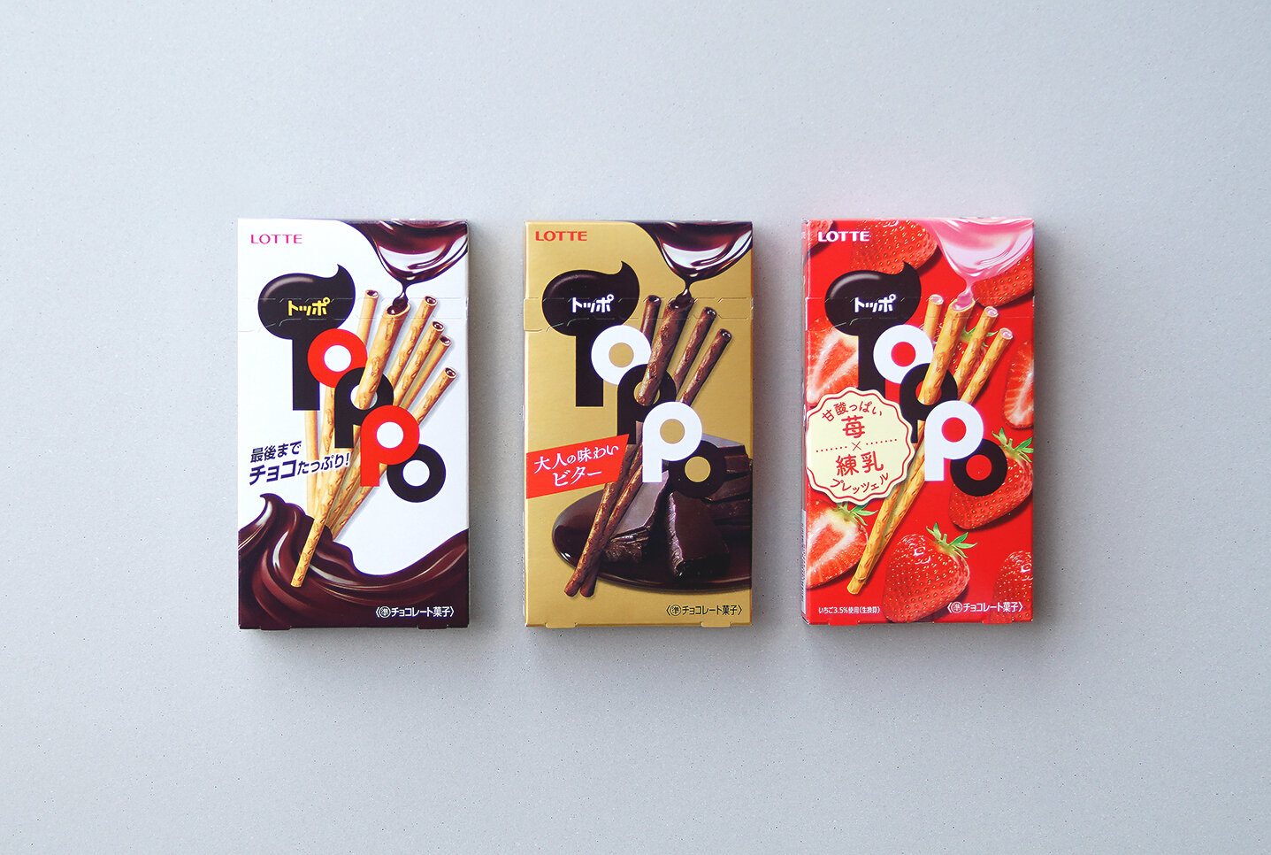
本格的な味わいにこだわり、旬の素材で丁寧に作られた、大人向けのToppoシリーズです。 パッケージには箔押の上品なロゴと、素材の旨みが凝縮したToppoシズルを表現することで、ワンランク上の佇まいを目指しました。

Made with carefully selected ingredients, this premium line is targeted at adults. By applying the elegant stamped logo on the packaging, and magnifying the TOPPO sizzle to express the condensed flavor and taste, we create a higher-grade appearance. 


Client:ロッテ株式会社 / 2015−2020